What Leopard's folder icons should have looked like
The first time I saw the new Leopard folder icons: "Wait, what? Is this a joke? Am I dreaming? WTF?!"
I don’t know about your story, but my story of the first time I saw the new Leopard folder icons goes something like this; “Wait, what? Is this a joke? Am I dreaming? WTF?!”.
In the end though when Leopard shipped, these new (from a lot aspects uglier) icons kinda grew on me and I didn’t really mind them that much after about a week. The old Aqua folders unfortunately look horrible as well in Leopard next to the rest of the UI.
Today I stumbled upon Jonas RaskThis link is dead and no longer works.’s latest work, MajiThis link is dead and no longer works..
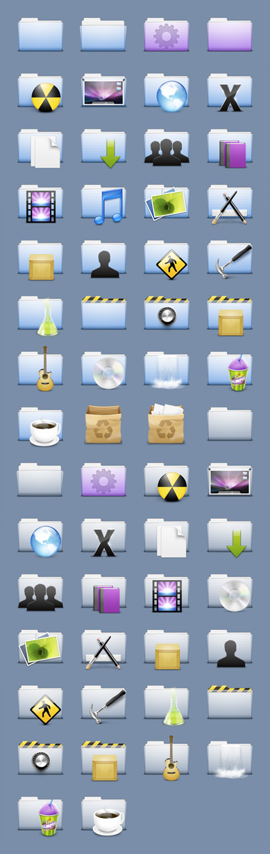
Jonas has done an amazing job with Maji (formally known as “QuickLook”) , and i’ve fallen in love with the icon set. It’s the icons Leopard should have shipped with in my opinion.
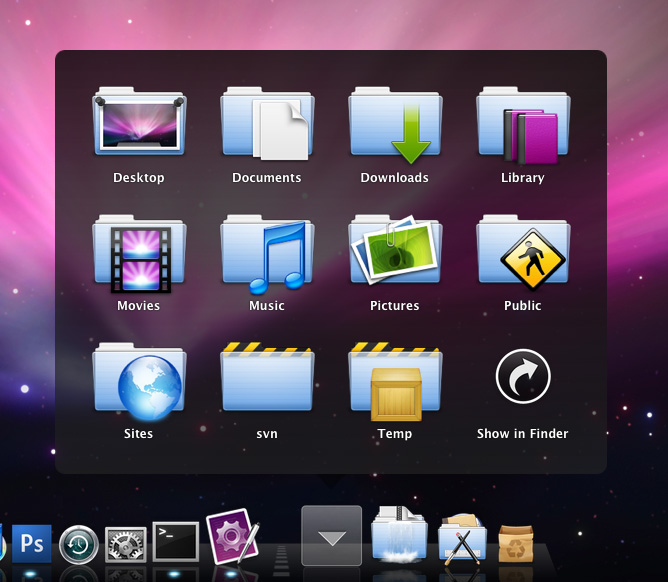
My only wish for Maji is that Jonas makes more icons for the set, and if I could have a wish, hard drive icons inspired/based on those found in the Agua icon set.
You can download Maji from the linked pageThis link is dead and no longer works.. Also check out CandyBar if you haven’t already, makes your life easy when it comes to installing replacement system icons.